Designing an Effective User Interface for USSD: Part2
by Mohit Saini and Aakanksha Thakur
Sep 15, 2015
5 min
This blog presents the behavioural insights from the user perspective based on the recent research conducted by MicroSave with a leading MNO in five geographies.
In the first part of this blog series “Designing an effective user interface for USSD”, we presented a comparative analysis of various access channels used for accessing mobile money services. This blog presents the behavioural insights from the user perspective based on the recent research conducted by MicroSave with a leading MNO in five geographies. The research aimed to gauge the experience of semi-literate mobile money users who access their mobile wallets using USSD channel. These insights will hopefully help providers simplify and re-design user interfaces, especially for users like Suraj.
WHERE ARE WE
The insights detailed below emerged from MicroSave’s field research specifically focussed on USSD based user interfaces.

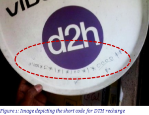
Numeracy is prevalent even among less/un-educated respondents. Most users often learnt the navigation flow by using only “numbers”. For instance, users quite comfortably used the short code *400*2*1* for self-prepaid recharge. Even new users, after a guided session, were able to memorise short codes/ numeric strings (like *100*1*1*2#) for completing their transactions. The preference for memorisation avoids the need to navigate multiple screens, thereby helping the users to locate the required option instantaneously and reducing transaction time.
b. Users suffer from a “tyranny of choice”
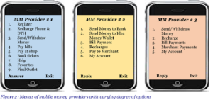
Like most of us, the respondents also face the paradox of choice. The user group often got confused while locating required service from various options on the main menu. This means that the “long list” type of menu is not suited for these users. In the USSD menu of one of the MNOs, instead of one option like Send Money, there are multiple options such as “Send Money to bank” and “Send Money to Money Wallet” which often confused users.
c. Users are “text averse”
Most users are not comfortable reading wordy options such as “Send to other mobile”, “Send money to any bank account” and “प्रीपेड रिचार्ज दूसरों के लिए” (Hindi for prepaid recharge for others). In the absence of additional help or detailed explanations (lack of which is a major limitation of USSD), these phrases look ambiguous to the respondents. Such phrases and sentences fail to solicit the required input from users.

The respondents often do not understand the sub-menu options displayed under a main menu option. This confusion is often due to presence of sub-menu options, which instead of being clubbed with “similar/complementary” main menu option, are present under “different/unrelated option”. For instance, on USSD main menu of an MNO “Agent locator” (a sub-menu option) is clubbed with “My account” (a main menu option). The users, however, perceived that “My account” option would display their profile details, mini statement, change/forgot password options etc.
Such unrelated clubbing of options also obstructs the discoverability of required mobile money services while navigating the mobile money menu. For instance, in the utility bill payments option, clubbing two different types of payments such as one-time payments (for example, charity) and recurring payments (such as DTH recharge) often leads to confusion.
e. Users often get confused with some “terms”
The present USSD menu is laden with complex terms and banking jargon such as merchant, beneficiary etc., which are not well understood by the users. This hampers navigation, since users are less likely to discover services buried among a bunch of unfamiliar terms. Interpretation of certain banking terms in Hindi (which are quite complex as well) such as आदाता (Receiver), लाभार्थी (Beneficiary) etc. is often more difficult.
WHERE WE’VE TO GO
a. “Geography” specific main menu
While a broad range of mobile money services are offered, the services which see aggressive adoption by users varies from location to location. The use-case differs substantially among users in rural and urban areas. In rural areas, for instance, users prefer mobile wallets for DTH recharge; whereas in urban areas, bill payments have seen widespread uptake. Send Money, similarly is preferred in urban areas and Withdraw Money is more common in rural areas.
USSD menus should be redesigned by considering geography specific needs. Subsequently, various main menu options should be prioritised. Users will not only find the USSD menus more appealing, relevant and tailor-made, but will also avoid navigating less/un-important options.
b. “Limited” unbundled main menu
Mostusers prefer an explicit ‘unbundled menu’ with limited number of options. Needless to say, “re-designed menu” must consider the small screen size limitation of widely used basic and feature phones; as these users otherwise may not prefer scrolling multiple (vertical) options. Such a menu should host geography specific, “basic” and “frequently used” services. Overall, an unbundled menu must be designed to simplify the “discoverability” of useful mobile money services.
c. Nesting only “complementary” options
The sub-menu options should be aligned and clubbed under “relevant” and “complementary” main menu options. Related service features/options should be housed under one “umbrella” term; which is easy to understand. Such bundling will significantly improve the interpretation, awareness and usability of sub-options. For example, an option such as “Agent Locator” can be clubbed with a main menu option such as ‘Send Money’, as the location of the outlet (for P2P transfer) at cash-out geography is of prime importance to the sender.
d. “Customised” menu based on usage history
Usage behaviour of the mobile money users can be leveraged to explore the possibility of a “dynamic” main menu. This feature presents an option to derive a “new” USSD menu depending on users’ transactions behaviour. The main menu options, can get automaticallyprioritised and present a “re-designed” and “customised” menu to its users. Providers, of course, will find it technologically challenging to design such a dynamic menu as the follow-up sub-menu options are dependent on user’s inputs.
e. Using “familiar” terms
Most of the respondents, both illiterate and semi-literate using mobile phones and money transfer services, were familiar with certain English terms used commonly in banking and telecom industry. Words such as sender, receiver, recharge, balance, cash-in etc. are self-explanatory and easily understood. These terms can be used to “simplify” the interpretation of mobile money services, thereby limiting the degree of mediation required.
In addition to the suggested changes, the providers may further “create” and “promote” simple and easy to use numeric strings for some of the frequently used mobile money services such as prepaid recharge, DTH recharge, send money etc.
Navigation in itself, of course, does not necessarily offer a standalone solution for simplifying user’s experience. However, the design of USSD menu certainly influences adoption and degree of usage of mobile money. The need to design an easy and intuitive USSD menu, hence cannot be undermined.
Written by

 by
by  Sep 15, 2015
 5 min
5 min
Leave comments